Landing pages are one of the most crucial parts of any site design. The difference between getting these right or wrong is one you’ll feel almost immediately in your pocket as a site owner.
Despite a proliferation of detailed landing page breakdowns online, we’ve all had that experience of clicking on an interesting looking ad or link only to be confronted with bland, low-impact content.
You only get one chance to make a first impression as the old saying goes and, for far too many sites out there, that initial encounter is a deeply underwhelming one.
In this article, we’ll take a look at seven exemplary landing pages to learn from, and point you in the direction of useful further resources for spiffying up your landing pages in WordPress and beyond.
Let’s make sure we’re all on the same page first though.
The Anatomy of a Landing Page
Finding the right elements to include in a landing page should really be a solved problem at this stage. There are innumerable infographics around the web that break the matter down in considerable detail.
Neil Patel has a great overview of how to create a killer landing page over at his site if you’re looking for an in-depth piece, but most of the elements that should be present are simply common sense:
- An engaging headline: Headlines are your first and often only chance to nab the reader’s attention. Use them wisely.
- Eye-catching imagery or video: High-quality video and photos keep people from clicking away. If there’s a person in there, all the better.
- Clearly stated benefits: People are inherently self-interested. Make sure you’re being clear about what’s in it for them.
- Put the most important elements first: Rather than get dragged into debates about the fold in a multi-device world, let’s just say you should be putting important elements near the top of your content – as people have been doing for centuries.
- Avoid distracting links: Your landing page should be focused around one clear action you want the user to take. Cut away distracting navigational options.
- Provide detailed descriptions: Certain segments of your audience will want detail and technical specs. Cater to them.
- Testimonials: Everybody wants social proof. Make sure you’ve got recommendations from real people on your site.
- Trust elements: If there’s any sort of trust seal available that’s relevant for your offering, it should be displayed prominently on your page.
None of these ideas are groundbreaking or new. All of them are incredibly effective. Make sure you’re putting them to work.
Let’s move on to some classic examples of these techniques in action.
1. Email1k
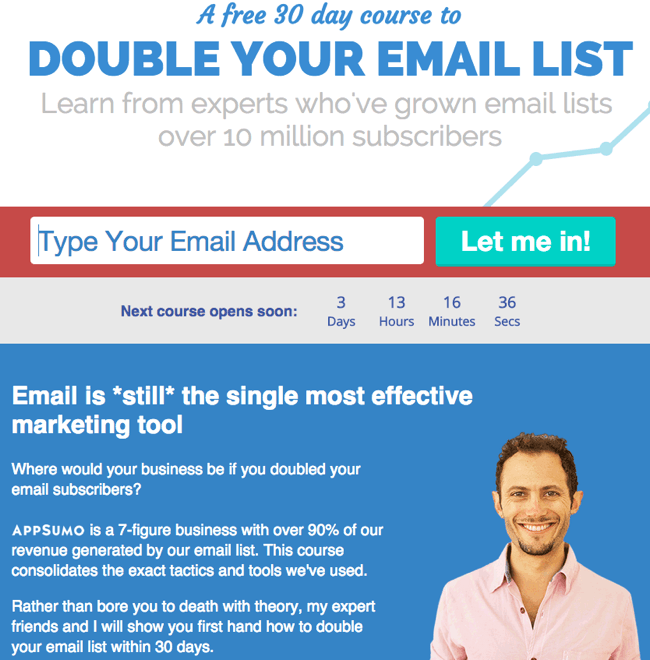
There’s a lot to like about the landing page for Email1k – a course designed to boost your email newsletter subscribe rates.
Let’s start with the visual design. Confident typography and a striking color palette combine to make you feel you’re dealing with a professional offer straightaway. There’s a nicely integrated scarcity factor at play in the form of a countdown to the next available course, and some admirably direct copy making the initial pitch.
The call to action also couldn’t be more prominent if it tried and you’re instantly presented with a trustable looking real live human as well. Those in the know will recognize that human as Noah Kagan but, even if you’ve never heard of him, it’s an excellent example of using a high-quality image to lend a personal touch to a landing page.
All of that’s before we even get on to the stellar list of product testimonials from giants of the internet marketing world such as Bryan Harris and Brian Dean. Scroll a little further down and you’ll see enticing product bonuses from services such as WP Curve and Wistia.
This is a landing page put together by an absolute pro and it shows.
2. The No-Stress Guide to Negotiating Your Salary
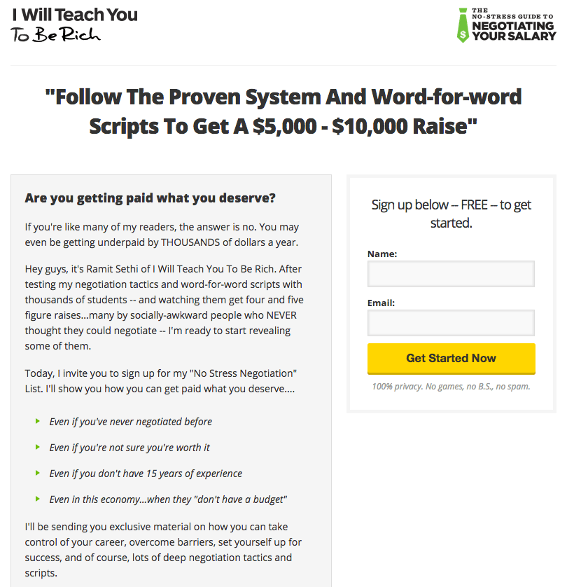
Ramit Sethi is a man who knows a thing or two about consumer psychology and building wealth. You can see all that expertise on display at the deceptively simple landing page for his No-Stress Salary Negotiation course.
Ramit is justifiably famous for his commitment to salesmanship in print and this landing page is a superb example of the power of well-crafted copy. The headline sets the stage with a combination of promise and detail and is swiftly followed by a question guaranteed to grab the attention of virtually any reader: Are you getting paid what you deserve?
After that we’re into a no-frills breakdown of exactly what’s on offer and why you need it, along with a call to action that couldn’t be simpler. Even the microcopy here is carefully considered: 100% privacy. No games, no B.S., no spam.
This all looks simple on the page but there’s an awful lot of copywriting skill on display here and the execution is spot-on. I’d be amazed if this landing page wasn’t converting extremely well.
3. Vivino
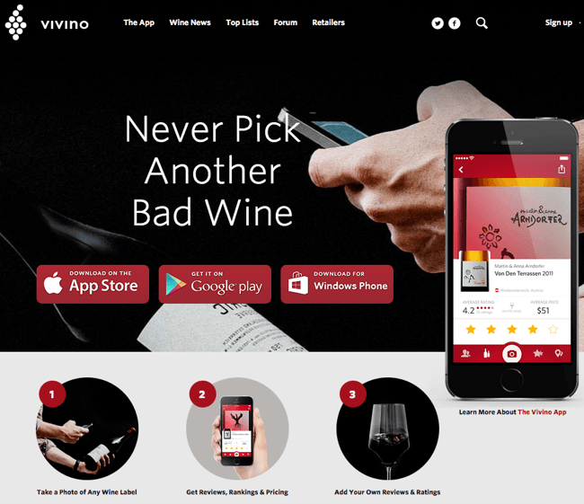
Life, as we all know, is too short to drink bad wine and the good folks at Vivino have an app dedicated to making sure that unfortunate event never happens. Their homepage is a classic example of a well-executed app landing page.
Let’s start with the headline: Never Pick Another Bad Wine. In terms of pithily summing up the app’s value proposition, that’s hard to beat. We’re immediately presented with a high-quality shot of the app in use and prominent links to the three app stores where it’s available.
If you include the microcopy on the call to action buttons here, this page has already done pretty much all it needs to in a grand total of 19 words. Are your landing pages packing that much punch out of the gate?
Things stay similarly solid as we move down the page. The app’s functionality is briskly explained with three well-chosen images in step sequence and you’re then taken into up-to-date wine-related news items. These are followed by smartly integrated search options and listings of top wines.
It’s worth dwelling on the sequence here for a second. Someone has clearly put themselves very much in the mind of a potential user when designing this page.
On first glance, the visitor has the option to instantly take action in the form of the app sign-up links. If you have any type of interest in wine, you’re almost certainly going to be open to either reading about it, searching for particular varieties or browsing listings of recommended vintages.
Vivino are making sure they hit all those potential desire points in a carefully considered sequence while constantly providing interesting reasons to stay on the site. Is your landing page doing the same?
4. Vote for Pat
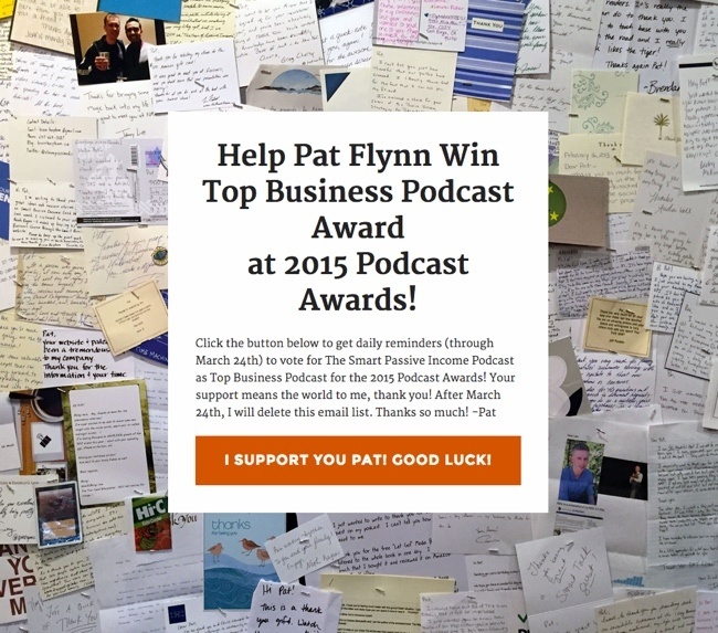
The next example is one we stumbled across while browsing the LeadPages site. LeadPages provide excellent SaaS options for quickly putting together landing pages. Their blog contains a lot of food for thought on the topic.
In this case, the landing page we’re looking at is a highly-focused offering from Pat Flynn (of Smart Passive Income fame) asking users to vote for him in the 2015 Podcast Awards.
There are a number of takeaways with this one. Firstly, solutions such as LeadPages exist for automating several aspects of putting together high-quality landing pages. The example here from Pat is taken from their extensive list of templates. We’ll provide some more resources like this later on.
Secondly, Pat’s example shows that – with the ability to crank out landing pages quickly – you can start getting very specific indeed in terms of what you’re using them for. The action Pat’s trying to get users to take here is extremely targeted, and smart to boot. He’s making a very personal appeal to his user base and setting up opportunities for reciprocal favors somewhere down the line.
Finally, the visual design shows you have opportunities to be creative on every type of landing page. Setting the call to action off against a backdrop of hundreds of hand-written thank you letters from real fans provides a wonderfully personal touch. It also sneaks in lashings of social proof in a truly elegant way.
It’s worth pointing out that you have literally two options on this page: perform the desired option or leave. As with some of our previous examples, this all looks simple at first glance but there’s a lot going on here you can learn from.
5. Asknative
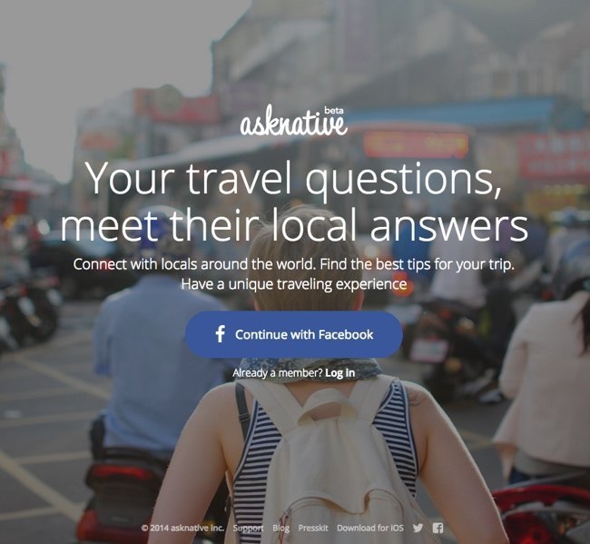
We’ll close out our list with one eye fixed firmly on foreign lands. Travel startup Asknative aim to match travellers with locals to the mutual benefit of both.
It’s a new but surprisingly crowded field so the pressure is on to hit it out of the park with the landing page. Let’s look at how they go about doing that.
The first thing to notice is the selection of large-format images the landing page cycles through. These all have three things in common:
- High-quality: None of the images here would look out of place on a gallery wall.
- User-centered: Each picture is taken from the perspective of a traveller. They’re subtly dropping you into the world they want you to explore with their app.
- On-brand: Watch the images cycle by and you’ll see they’re hitting a full range of travel experiences: urban, back-to-nature, exotic and so on. More often than not, a form of transport is also subtly included in the image to reinforce the central travel theme.
Moving on to the text, Asknative gets things right with a crisp headline paired with follow-on text that sells the benefits in less than 20 words.
Let’s explore the call to action a little more closely. You’re being asked to do basically one thing on this page – sign in with Facebook. Considering that travel experiences (pictures, posts, videos) are omnipresent on Facebook, this is a very smart way to be getting potential users to sign up with this type of app.
It’s a point worth pondering for your own landing pages: have you pared your call to action down to the one thing you’re sure will move the needle for your business?
Landing Page Solutions
We’ve already briefly mentioned LeadPages as a solid landing page solution provider. Other services worth checking out include Instapage, Unbounce and GetResponse.
There are also a number of WordPress-based landing page plugin solutions out there with OptimizePress being the market leader.
We should also point out that Enfold is more than capable of being used to make high-impact landing pages. Our landing page example is just one illustration of how you can put Enfold to work in this regard.
The blogs of any of the providers mentioned here typically contain highly useful info about how best to plan your landing page strategies. The following three podcast episodes also contain a lot of nuggets for those wishing to dive deeper:
- Rapid Audience Building for Accelerated Hypergrowth from Pat Flynn.
- The Psychology of Landing Page Design from Unbounce.
- How to Craft Landing Pages that Work from Rainmaker.fm.
Conclusion
Landing pages are one of the most high-impact online tools you can use to transform your business from good to great.
As the examples above show, the basic principles behind an excellent landing page are simple, but execution and attention to detail are what make the difference.
Let’s briefly recap the main points that our examples all got right in one way or another:
- Use a well-crafted headline.
- Employ eye-catching imagery and/or video.
- State benefits clearly.
- Lead with your most important content.
- Avoid distracting links.
- Provide detailed descriptions where appropriate.
- Include testimonials.
- Include trust elements.
The examples we’ve selected all reward careful study and there are thousands of other pages out there to learn from.
Let us know how you’re doing with your own landing pages. Are there particular tools you’re using or tactics that have brought you success? Get in touch via the comments and let us know.


